Cookie Consent by Free Privacy Policy website

The mood of

Michael Hilal

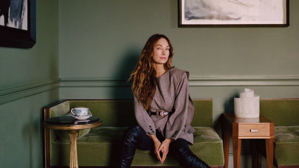
Born to a naturally talented Mexican mother, Michael Hilal has not fallen short of his self-taught qualities. Before making it to AD’s New American Voices list, the San Francisco-based creative had a career in tech at HP, Google, and Lime. He turned a new page in 2020 when he founded his California-based design and interior architecture studio. The nature and sun of the Golden State undeniably influence the personalities of those who grew up there. Like his Californian counterpart Kelly Wearstler,Michael draws his energy and creativity from the slow pace and welcoming climate of the West Coast. In fact, he named his first furniture collection designed for St. Vincent « Big Sur » as a tribute to his native region, blending casual sophistication with a sunny palette in his projects. Meet the new face of Californian design.

‘Pine Needles’ project by Michael Hilal © Shade Degges

Which day and time is it? What do you usually do at this time of the week?


« It’s Friday, 1:36 AM. I’m taking a moment to breathe and follow up on anything pending before the weekend. We’re a small team, and I like to plan everything in advance for the upcoming week so that I can relax during the weekend. »

« Pinehill » project by Michael Hilal © SEN Creative

Your mood of the day in one word?


« Grateful. »
Your current creative desires?


« They are insatiable. I want to explore everything! »

« Big Sur » collection by Michael Hilal for St Vincent, Antwerp

What is your temperament?


« My mood is rather good. I think it’s really tempered by the Transcendental Meditation that I try to practice twice a day for 20 minutes. »

The project that occupies you the most right now?


« We are working on what was once a mid-century ranch in the middle of the forest, transformed into a modern farmhouse. We’re moving away from the ‘modern farmhouse’ feel in favor of a more contemporary ambiance while preserving some traditional aspects. It will be a charming house with stunning details. The clients have good taste, and there is an unexpected level of trust and respect. »

What are the inspirations?


« It’s a blend of Charlotte Perriand’s Arcs, California craftsmanship from the 1970s, and a touch of reinvented English cottage. We really considered how the family lives there (they are very creative and warm) and tried to translate their somewhat bohemian side through craftsmanship. »

« The Arcs » by Charlotte Perriand

What is the color palette associated with this project?


« Being located in the woods, we have used a lot of natural tones for the house, creating a serene palette. »

« Big Sur » collection by Michael Hilal for St Vincent, Antwerp

What, in your opinion, has influenced and shaped your taste?


« My mother. She has fantastic taste that I couldn’t fully appreciate when I was younger. She collected a mix of contemporary, vintage, and antiques, bringing them together with white slipcovers and upholstery fabrics.

For example, she would pair an art deco sofa covered in white mohair with Queen Anne chairs draped in white linen, then add wood that would be considered wabi-sabi, even before it was recognized as a trend. She was really doing Axel Vervoordt, at a time when she didn’t even know who he was.

Axel Vervoordt

Axel Vervoordt

Axel Vervoordt

Axel Vervoordt

Axel Vervoordt

Axel Vervoordt

I recently reflected on how incredible it is that a Mexican woman without formal training in California has such innate instincts, considering that people who have been educated in this field can work their entire careers and not have such a strong aesthetic effortlessly. »

Form, function, or fantasy?


« Fantasy… But because I am strict, it must have a hint of function. I can’t stand an unusable table. »

« Her Study » project by Michael Hilal

A favorite art movement?


« The Vienna Secession. You see echoes of it everywhere. We wouldn’t have Arts and Crafts, Bauhaus, Mid-Century Modern, or 1970s contemporary without it. »

Gran Casa Glückert – Joseph Maria Olbrich

« Sitzmaschine Armchair » by Josef Hoffmann, 1905.

« Tea service » by Josef Hoffmann, 1910

A color palette you’ve always followed?


« Unfortunately, I have a cold heart and live surrounded by neutrals (mostly blacks and beiges). With clients, it’s a different story; many of them reach out because I really know how to use color well. I would respond to that not necessarily in terms of a specific color range, but more in terms of tones. Something constant, earthier tones – blues and greens with touches of browns. »

Your current color match?

« Three Farrow and Ball shades: Vert de Terre (No. 234), London Clay (No. 244), & Light Blue (No. 22). »

Your last three artistic favorites?


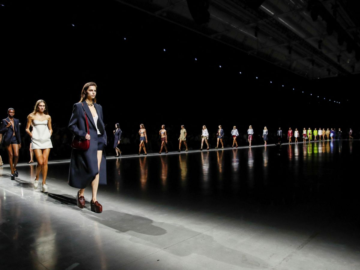
« Sabato De Sarno’s Fall/Winter collection for Gucci. I really wanted not to like it, but it was perfect. It seemed archival but refreshing. I love the structure; I’m tired of living in sweatpants.

Gucci Men's Fall Winter 2024

The Loie Hollowell: In Transition exhibition at the Jessica Silverman Gallery in San Francisco. The paintings had none of what I would have considered interesting normally, but it really changed my perspective on what is probably considered by some as subversive feminist art. Her works are very intriguing and appear more abstract than they actually are. When I saw them, I was fascinated by the layers and the vibrancy of color.

Loie Hollowell : In Transition – Jessica Silverman Gallery

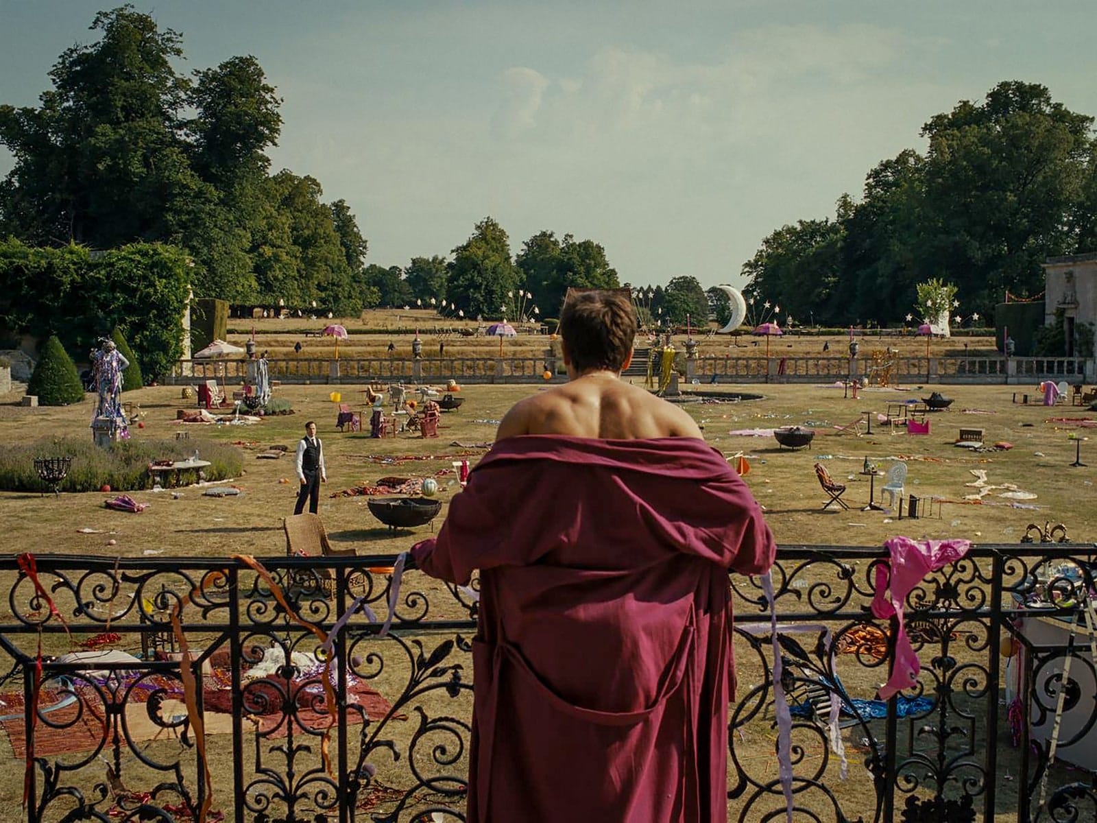
The film ‘Saltburn’ by Emerald Fennell for all the reasons you know… I’m a cheap date. »

Saltburn

The latest designer you’ve spotted?


« The inimitable Adam Charlap Hyman. I encountered him at the Young Collectors Night at the Winter Show in NYC a few weeks ago. »

Studio Charlap Hyman & Herrero – Aesop Boston

Studio Charlap Hyman & Herrero

Decorators and architects who influence you?


« Lauren Geremia (AD 100) for her way of injecting craftsmanship and art in a truly intellectual manner into her projects.

© Lauren Geremia

© Lauren Geremia

© Lauren Geremia

And Tadao Ando. You might not really see a direct correlation in much of my work, but it has truly informed my approach to the fundamentals of interior design. The idea of creating a space that feels very simple and clean but with hidden complexities. His interaction between the interior and exterior has also framed my thinking about life in California.

Tadao Ando Museum

There’s also John Baldessari, a local California hero for me. I love contemporary art with a touch of humor. Not everything has to be so serious, but mostly, his social commentary is always a bit sharp. »

3 inspiring Instagram accounts?


« It’s tough, there are so many! @lalamichmich because she has truly defined brutalism in interiors; @loewefoundation because the artists they support always seem to be spot-on. And the director of the Department of Decorative Arts at the Louvre, @olivier_gabet. »

The last address that impressed you?


« 15 Rue du Lau, 91490 Milly-la-Forêt in France: Jean Cocteau’s house. »

The interior of Jean Cocteau’s house © Sylvain GRANDADAM

The place you could go back to every week?


« Big Sur in California, an open gallery to nature. »


The architect who would build the house of your dreams?


« Tadao Ando, always. »

A film set that left an impression on you?


« Poor Things. The level of detail is astonishing. It will inform a trend of surrealism in interiors, mark my words. »

Poor Things set design

Poor Things set design

The book lying on your coffee table?


« The Fendi Set: From Bloomsbury to Borghese. The images are ethereal and beautiful. »

The Fendi Set : from Bloomsbury to Borghese

The Fendi Set : from Bloomsbury to Borghese

The next mood coming up, straight to your inbox!

Subscribe and be the first to know about the latest design trends, places and objects in our newsletters.