One word to describe your mood today?
«Energetic. »
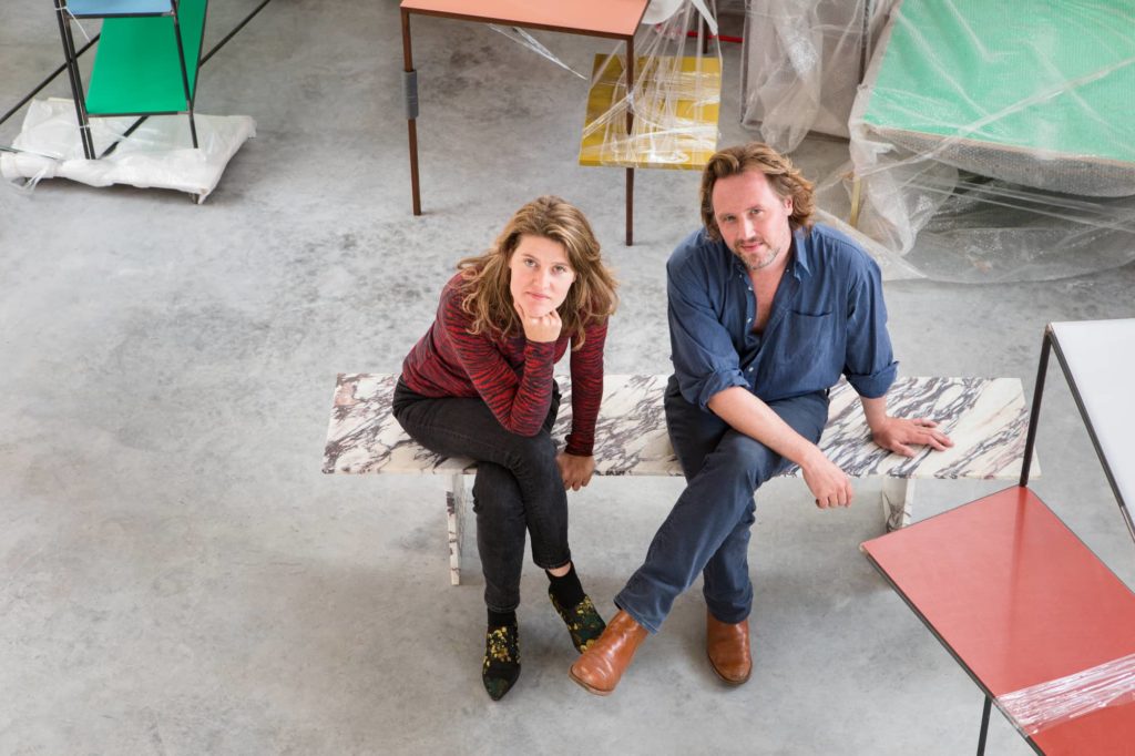
Hannes Van Severen was a sculptor by training, while, Fien Muller was a photographer. Twenty years after their meeting in Ghent, they proudly represent Belgian design under the name Muller van Severen internationally. Their signature style is instantly recognizable: simplicity of lines heightened by a primary color palette reminiscent of masters such as Miró, Mondrian, or Charlotte Perriand.
Twelve years after their formation, the Belgian duo was named Designer(s) of The Year 2023 by the Maison&Objet trade fair. For the occasion, Fien and Hannes envisioned a unique scenography bringing together a selection of their iconic works as well as new creations from their latest collaborations. Here’s a sneak peek before you can discover their installation from September 7th to 11th. Meet them.
One word to describe your mood today?
«Energetic. »
Form, function, or color?
« We have a primitive relationship with objects. Our approach, between simplistic lines and vibrant colors, is decidedly playful. The contrast between the desire to control the form and impose minimalist contours, while allowing colors to express themselves freely, is a great source of amusement. »
The mood behind your installation for Maison&Objet?
« We’ve envisioned a scenography that recreates a walk through a selection of objects conceived during our creative journey from 2011 to the present day. The installation revolves around three islands referencing our little oasis in the desert of Evergem that we’ve created within the no man’s land. We find our house, our workshop, and our garden, connected in a triangular relationship with a path between them. »
How did you imagine these spaces?
« We designed an immersive landscape inside a room. The walls erected around the stand symbolize a boundary: inside, our objects coexist as part of the same world, within the same intimate space. »
The color palette of the installation?
« Bright blues, reds, greens, and yellows. Primary colors reminiscent of the chromatic work of De Stijl. On one hand, the colors act as a universal connector, while on the other hand, they engage in dialogue and link the objects together. »
How did you select the pieces?
« We brought together objects that reinforce and/or contextualize each other. They become strong and harmonious, without being overly balanced. »
Any new releases?
« Yes, a series of vases for Bitossi and a floor lamp developed for Valerie Objects. »
It will also be an opportunity to present in France two new pieces unveiled at the last Salone Del Mobile in Milan: the March and July rugs developed for Kvadrat. These new pieces are inspired by the different stages of natural sheep shearing. We have chosen to create different color families, searching for balance but also imbalance.