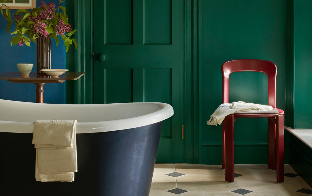
After the reign of pure white, interiors are finally breaking free, daring to embrace a more intimate, lived-in expression. Nothing is standardized anymore: every hue tells a story.Expressive, singular, audacious, colour takes centre stage. A perfect example: the rising popularity of colour drenching, a decorative technique that cloaks every element of a room in one single shade.
More recently, double drenching—a term coined by paint brand Little Greene—has made its mark. Here, colour no longer stands alone: it leads the dance through nuanced pairings. Still applied in an all-over manner, it is now accompanied by a related tone, from the same colour family but with enough contrast to spark surprise. A full-fledged chromatic manifesto.
Moodboard.
-
Colours
Demanded
-
Palette
Matchy
-
Must-have
Roller
-
Paint
Still fresh
A bold new layer

By transforming colour drenching into double drenching, the British paint and wallpaper brand Little Greene pushes the concept further—encouraging the use of two connected hues to coat every visible surface: ceilings, skirting boards, woodwork, furniture. Composed of unexpected yet complementary tones, the palette creates a bold, almost theatrical atmosphere. Monochrome is dead—long live double drenching!


Blue electrifies the mood

TivoliTM 206 ; WoadTM 251 ; Blue VerditerTM 104 © Little Greene


Going green


Light Bronze GreenTM 123 ; AmblesideTM 304 ; BassoonTM 336 © Little Greene


HopperTM 297 ; CitrineTM 71 ; Dark Brunswick GreenTM 88 © Little Greene

Sunset hour


Yellow-PinkTM 46 ; AffogatoTM 342 ; Middle BuffTM 122 ; BassoonTM 336 © Little Greene


La vie en rose


HelleboreTM 275 ; BlushTM 267 ; Lamp BlackTM 228 ; China ClayTM 1 © Little Greene


In collaboration with Little Greene.