Couleurs
25 février 2021
Couleurs
25 février 2021
Miró, Mondrian, Charlotte Perriand, Le Corbusier… A common point? Their innovative use of colors and lines. Starting with the three fundamental – or « pure » – colors (yellow, blue and red) and the desire to reveal both the useful and the beautiful, these geniuses of trichromy upset aesthetic codes and blurred the boundaries between disciplines as early as the 20th century.
Today, their work resonates in the work of the new generation of stylists, architects and designers. Jean-Charles de Castelbajac, Hermès, Muller Van Severen, Daria Zinovatnaya, Pani Jurek? Both iconic brands and the avant-garde of creation share the same philosophy: to claim a modern, uncluttered and, above all, functional art.
Movement
MODERNISM
Prescriptor
MONDRIAN
School
PRIMARY
Number
THREE
104 years ago, Dutch artists Piet Mondrian and Theo Van Doesburg established their creative dominance with the De Stijl artistic movement, which will never leave creation, fashion, art, architecture or design. Exclusively dictated by straight lines and ‘pure’ colors, the neoplasticist aesthetic is rigorous and academic.
Inspired by this modernist era, our La Consigne bottle collection takes its panache from the optimistic precepts established by these masters of color. A double offbeat tribute, both to the current, and to the traditional consignments retwisted with brilliant colors.
If the prescribers are Mondrian and Van Doesburg, followed by the Bauhaus school in the 1920s, two French names stand out in this utopian quest for color: Charlotte Perriand and Le Corbusier (founders of the Union des artistes modernes). Regularly commissioned to make spaces functional and adapted to modern life, they used primary polychromy to compartmentalize and brighten up.
The decade was also marked by the advent of tubular design, which is still being reinvented by new designers. Begun by Marcel Breuer in the 1930s as part of his research at the Bauhaus, the tubular steel revolution continues to gain ground, true to the colorful and primary language of the German school.
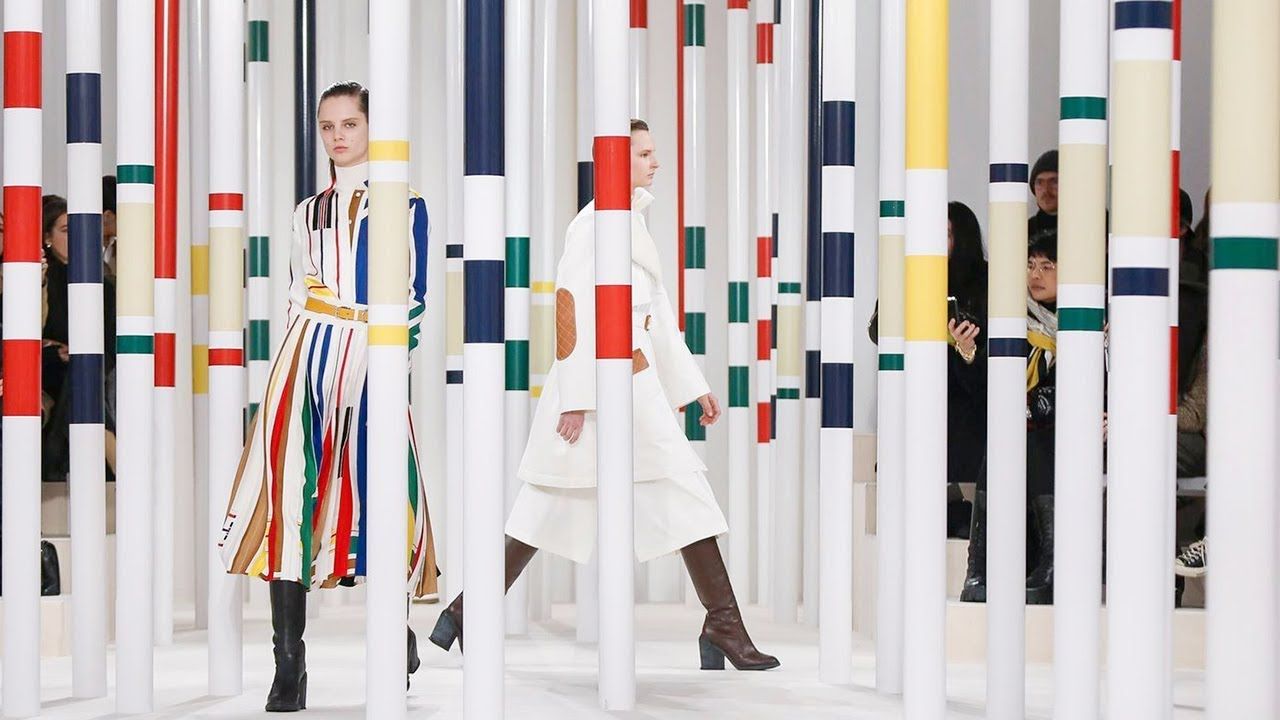
On the fashion side, it is Benetton that announces the color. To breathe new life into the house, Luciano Benetton and his new artistic director Jean-Charles de Castelbajac – nicknamed the « rainbow machines » – distil their industrial DNA on the Milanese catwalks, without half measures, with primary colors that stand out.
The same goes for Hermès, whose artistic director Nadège Vanhee-Cybulski was inspired by the modernist codes of the 80s and the universe of Jean-Charles de Castelbajac to create her autumn-winter 2020 collection.
The striking legacy of modernism is more than ever celebrated by young designers, especially those from the East influenced by the Russian Suprematism. Both the Ukrainian Daria Zinovatnaya and the Polish Pani Jurek fragment spaces like nobody else, transforming color into a vector for energizing spaces.